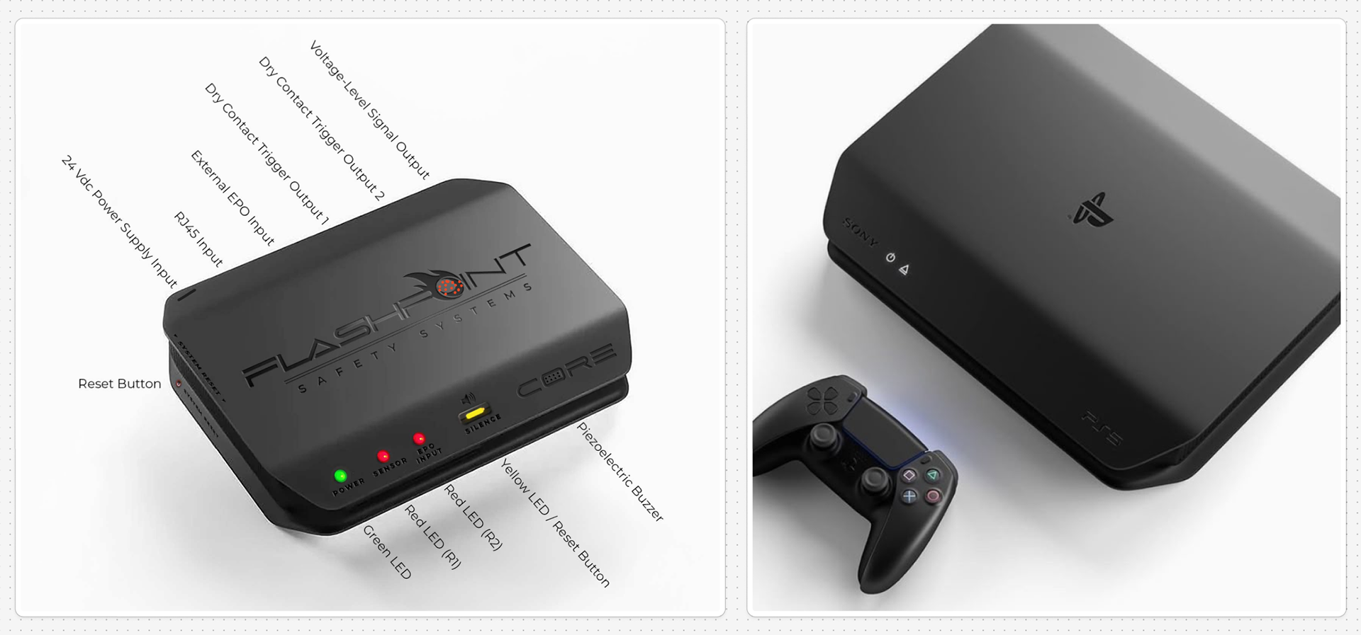
Client-provided reference mockup outlining light positions, input locations, and other key technical details. The client was drawn to the aesthetic of a conceptual PlayStation 5 housing, appreciating its clean geometry and visually engaging simplicity.
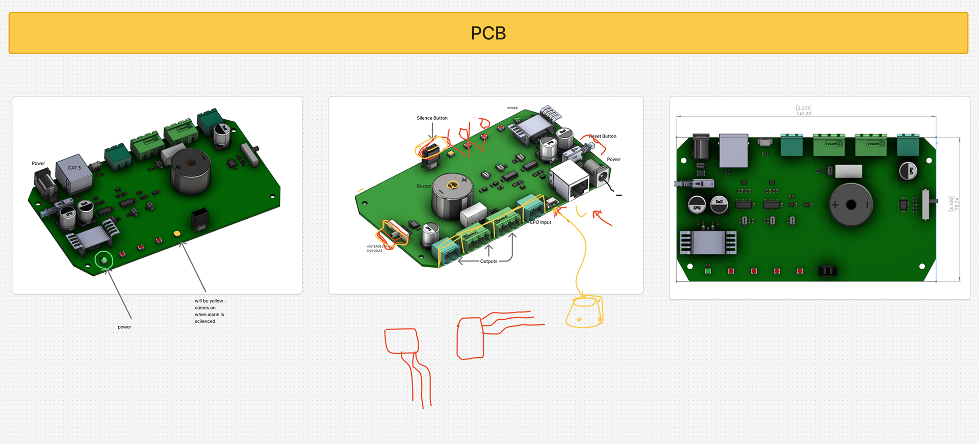
The client supplied the PCB with fixed components and dimensions, presenting design constraints that required careful consideration. These limitations shaped the final housing, demanding creative solutions to maintain visual balance and functionality within the established framework.
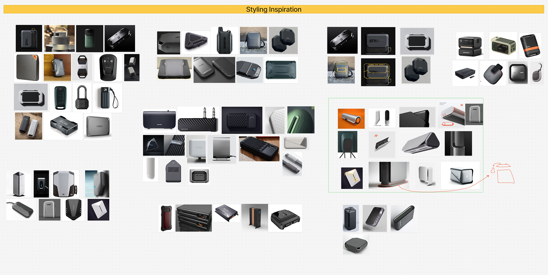
Form exploration focused on identifying visually striking electronic products with similar proportions. The research revealed a consistent theme of simple, modern, and rugged designs capable of standing alone on a wall while commanding attention. These references informed the design language, emphasizing strong geometry, visual balance, and a confident, standalone presence.
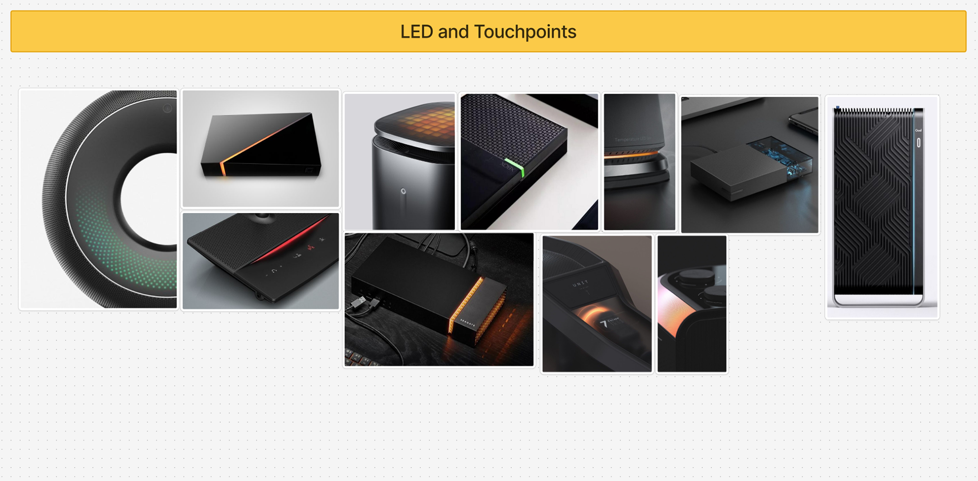
Additional reference imagery was gathered to study modern lighting in electronic products. Most examples featured a soft, ambient glow that subtly draws attention and creates a futuristic aesthetic. However, the client opted to keep the PCB lighting as originally designed, limiting opportunities to replicate the soft glow found in the references. This decision guided the design toward alternative methods of visual impact, focusing on form, proportion, and material contrast to achieve a refined, modern presence.
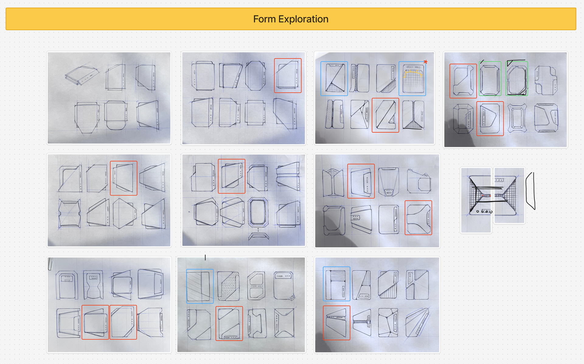
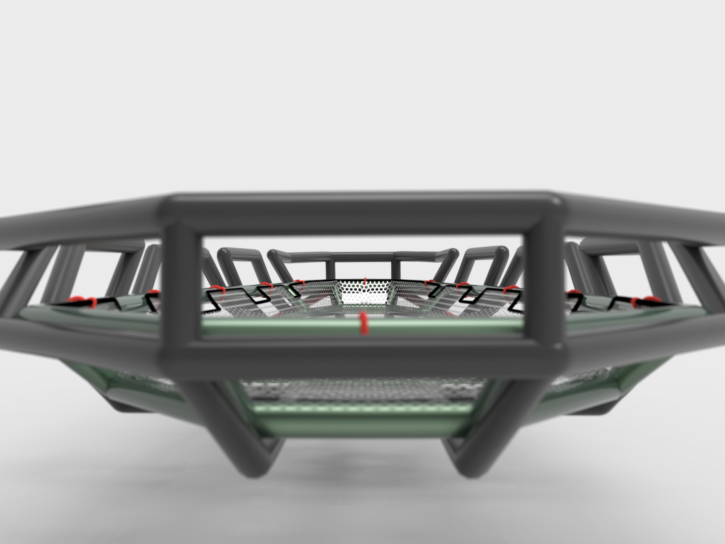
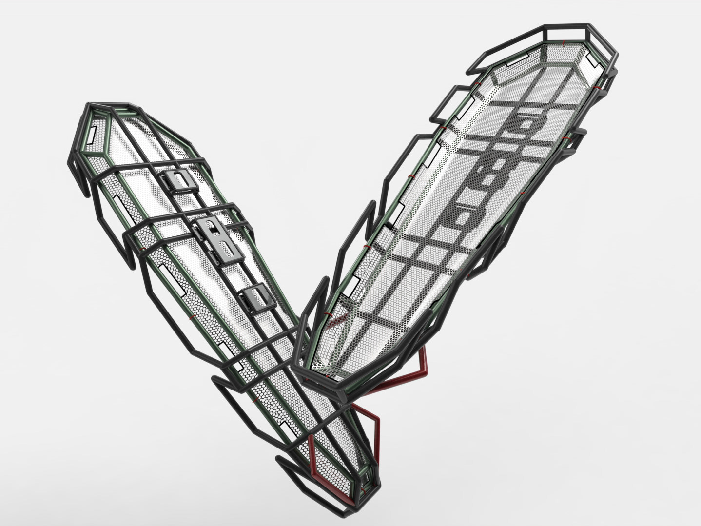
Multiple form studies were developed to capture the client’s vision for a modern, visually striking electronic housing. The designs combined strong rectangular geometry with angular details to convey both durability and a futuristic character. Indicator lighting was strategically positioned for quick, intuitive readability.
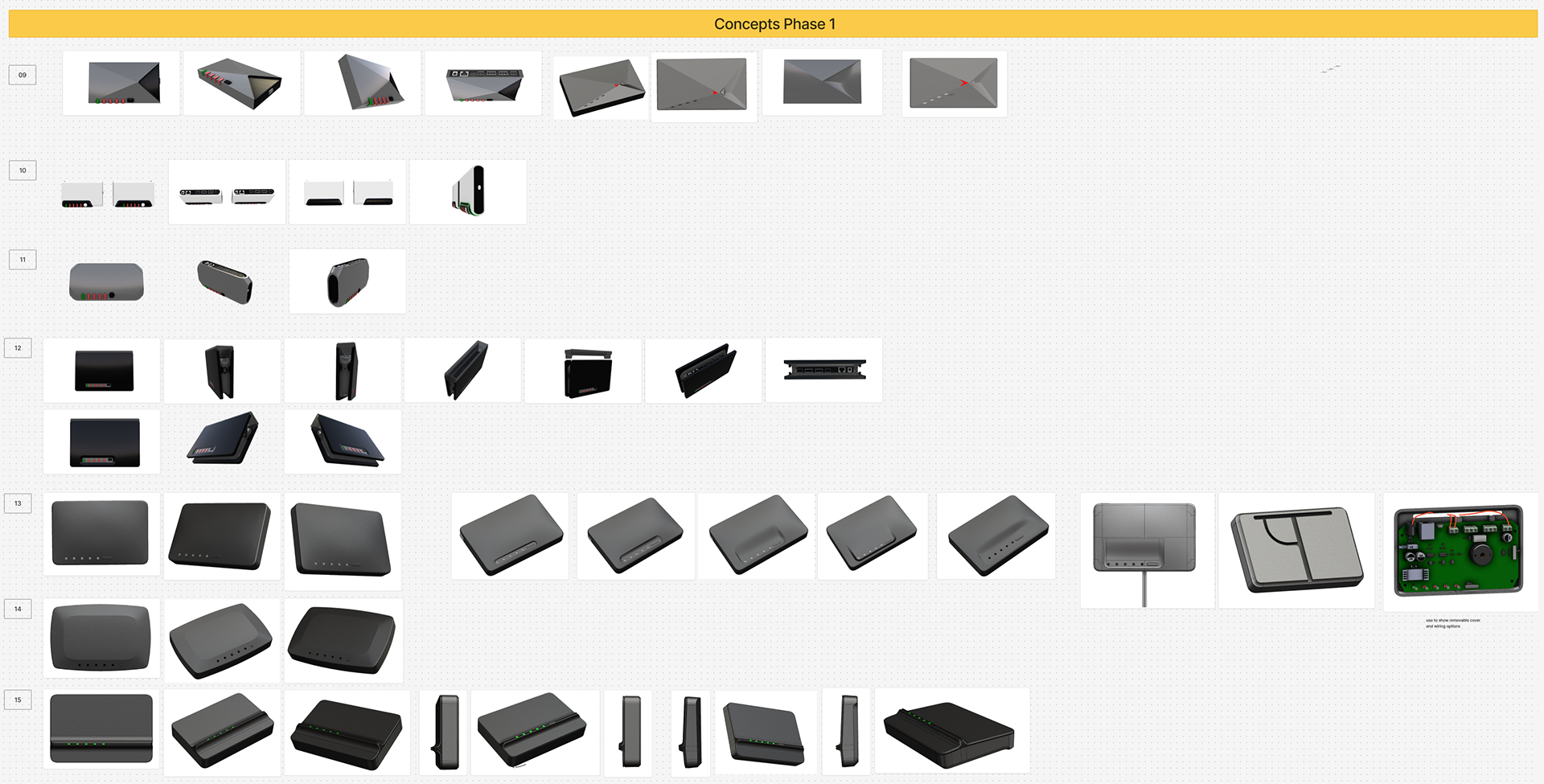
Rhino was used to rapidly develop 3D concepts that explored a range of forms, from angular and sharp to sleek and smooth, providing the client with multiple visual directions. Throughout this stage, the PCB was referenced to ensure accurate scale and precise placement of ports, buttons, and lighting elements.
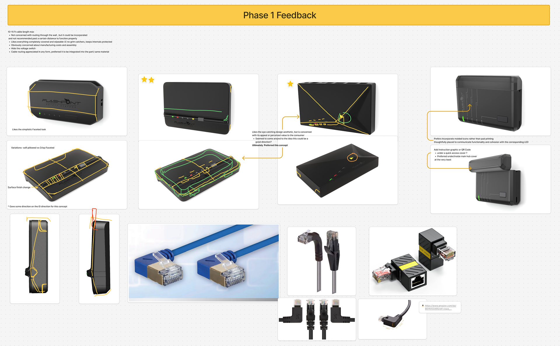
Following a client review, several concepts were evaluated and discussed. While Concept 09 was well-received, the client felt its angular, futuristic design might not age gracefully. They chose a simpler, more conservative approach featuring a clean front and flexible space for branding.
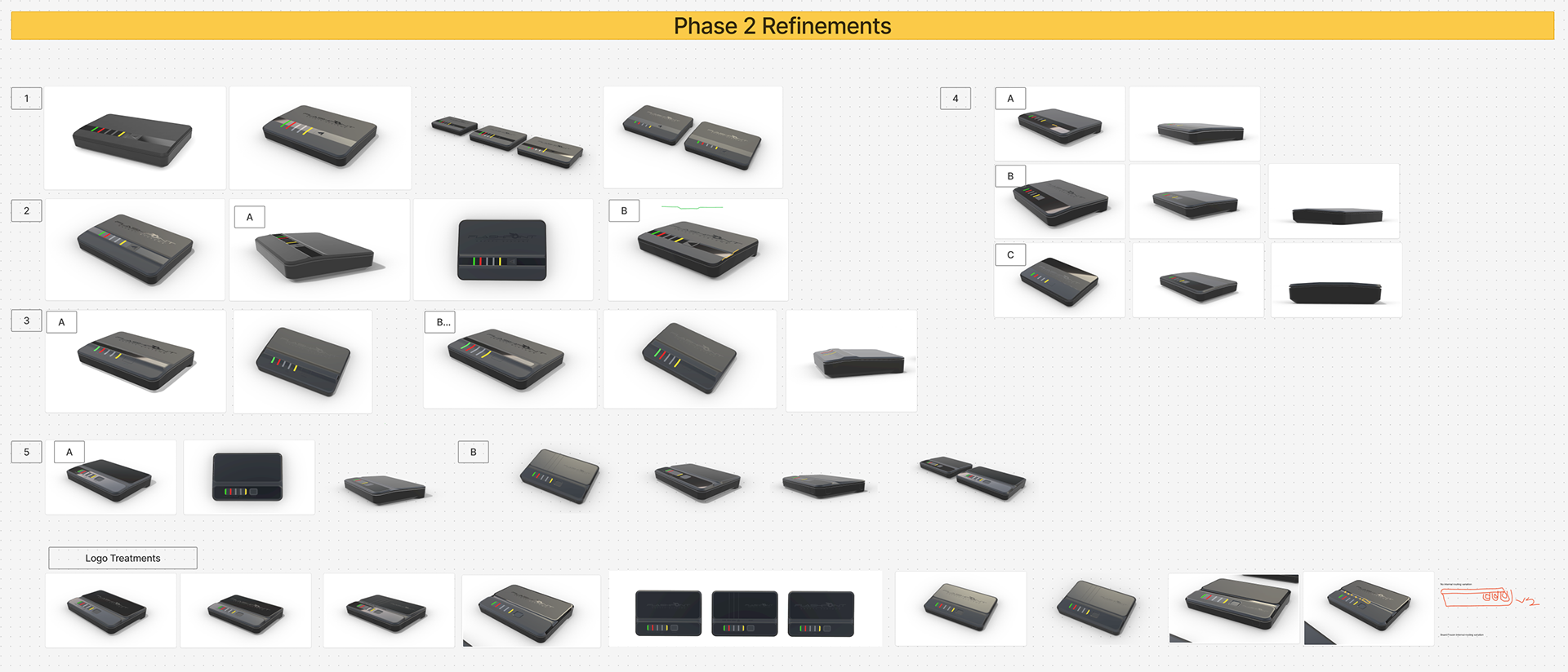
A second round of ideation focused on refining the client’s preferred concept and exploring how the form could evolve. Material transitions were tested to highlight key features, lighting shapes were refined, and button placement and form were carefully considered. Various logo treatments were also explored to integrate branding seamlessly into the design. This phase ensured that functional, aesthetic, and brand elements worked together cohesively in the final product.
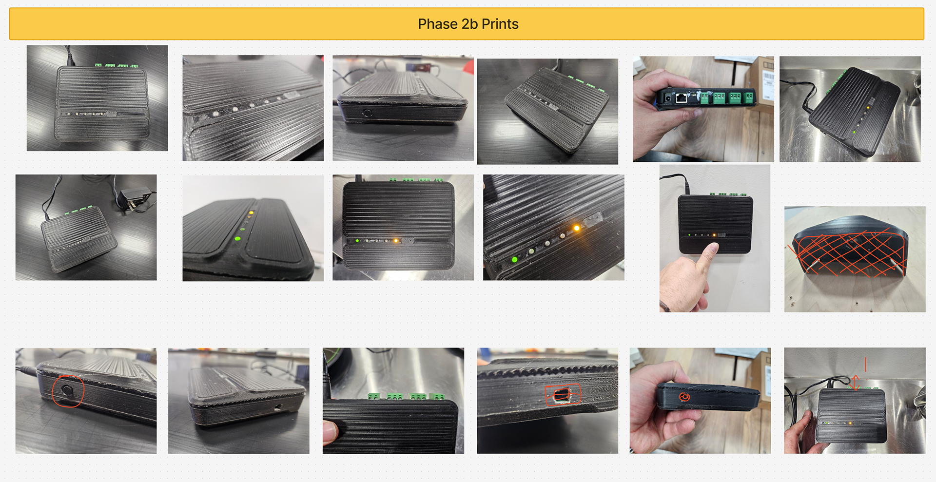
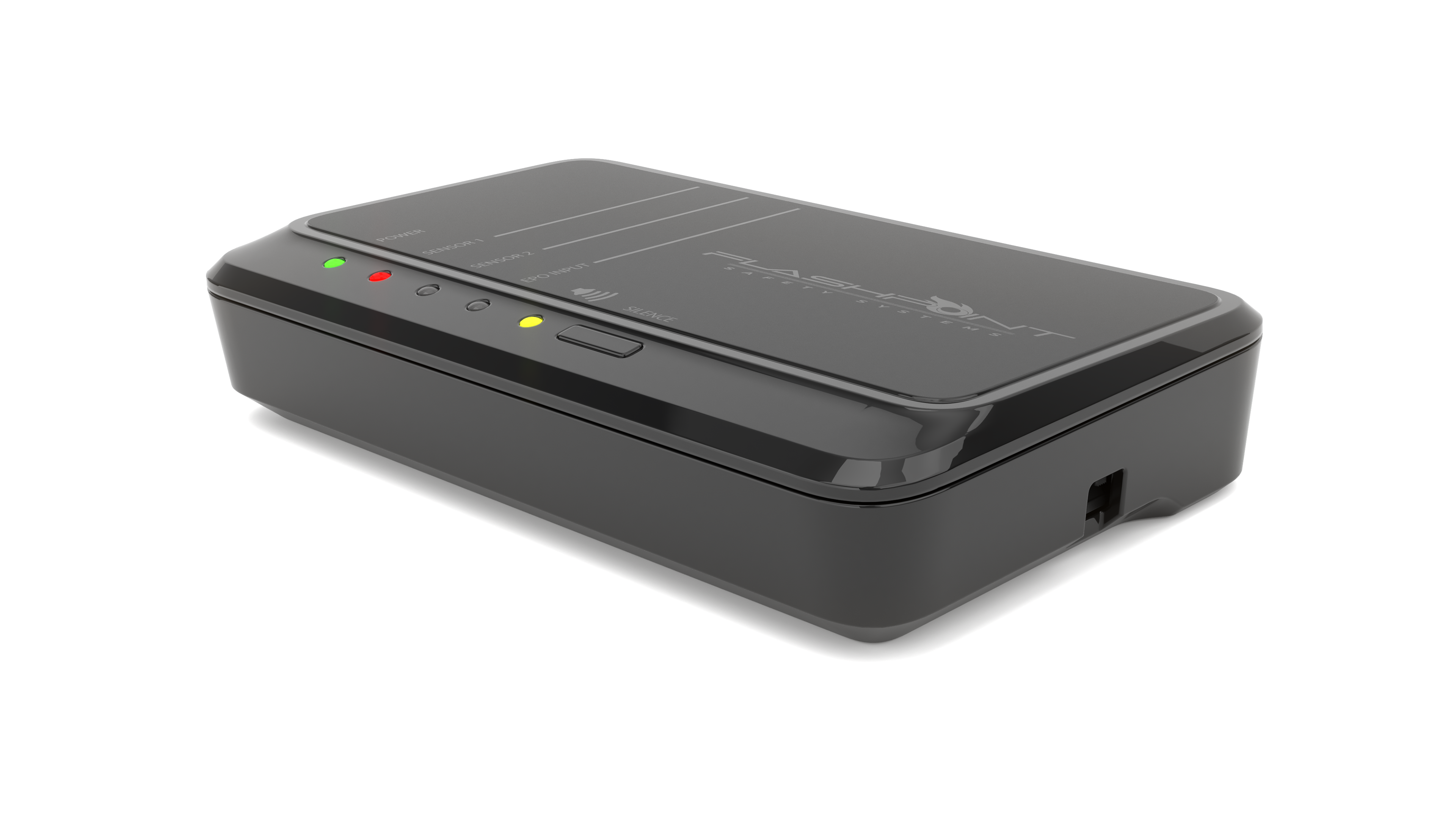
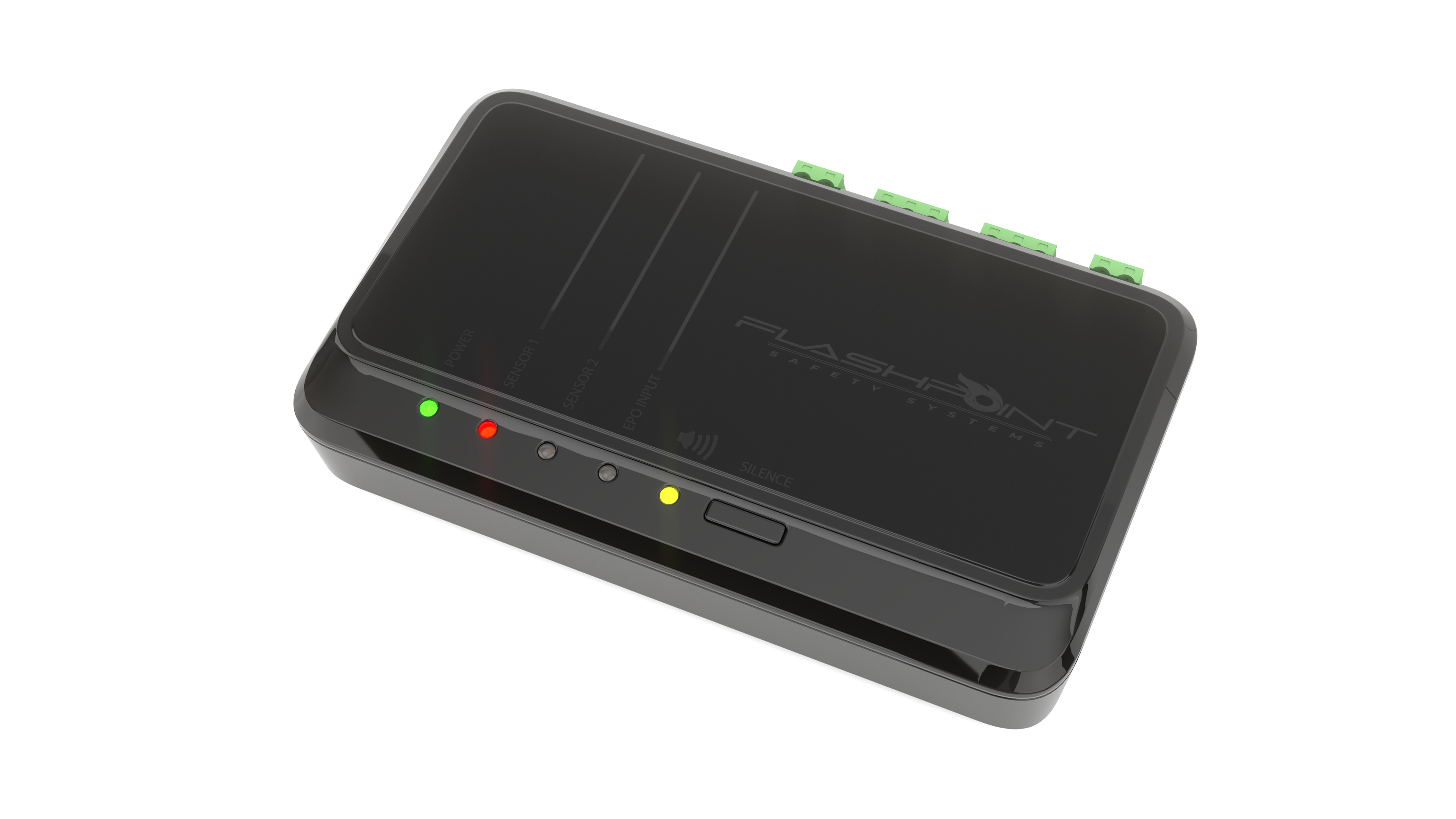
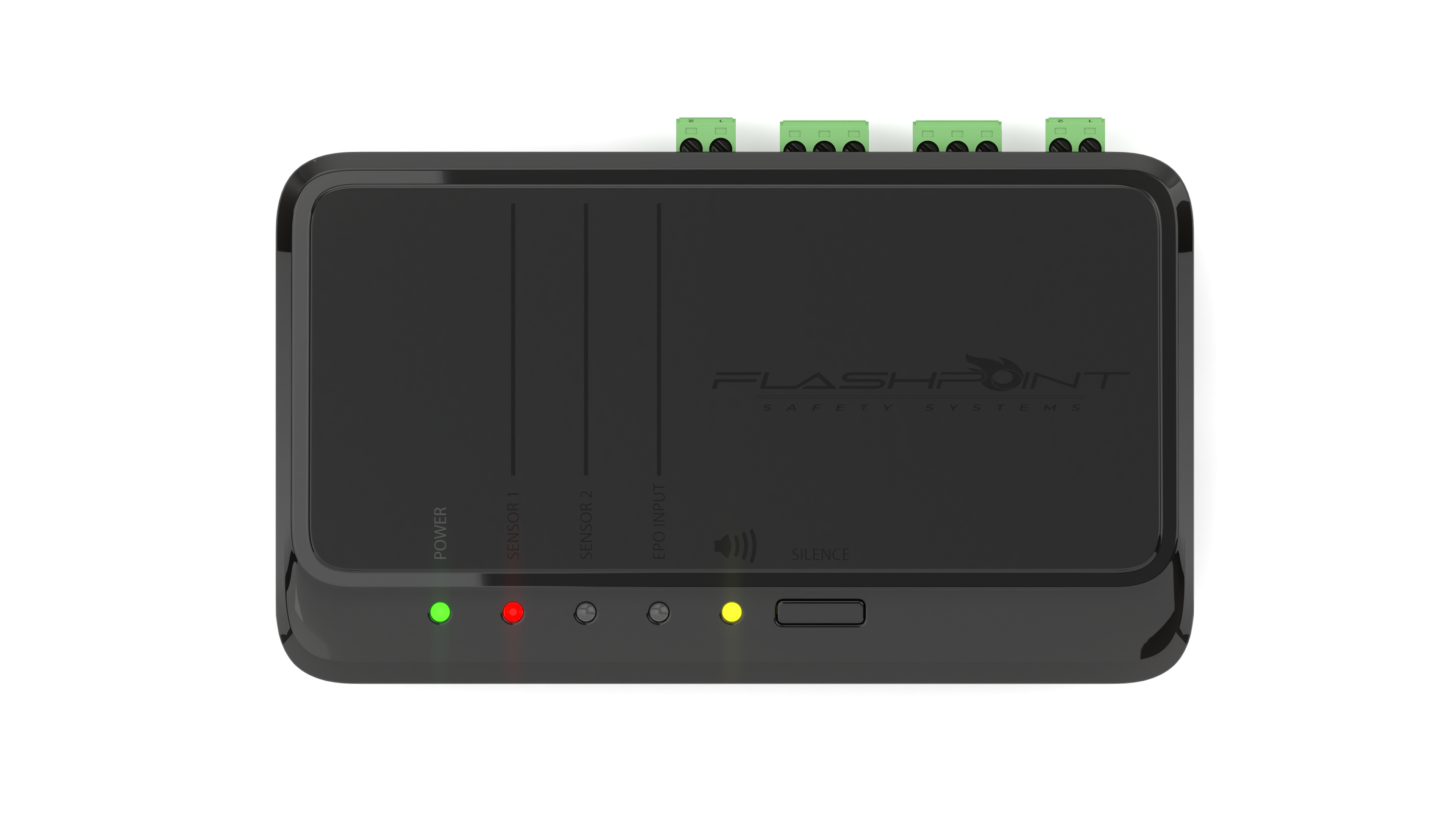
Following a client review, a design was selected and 3D printed to provide a tangible sense of scale and proportion. This prototype validated the concept and revealed opportunities for refinement, including mounting solutions, port sizing, and the placement of buttons and indicator lights. It was also determined that user clarity required labels for each indicator, which were added to the front of the product. This hands-on testing ensured the final design was both functional and intuitive, enhancing usability while maintaining a clean, modern aesthetic.
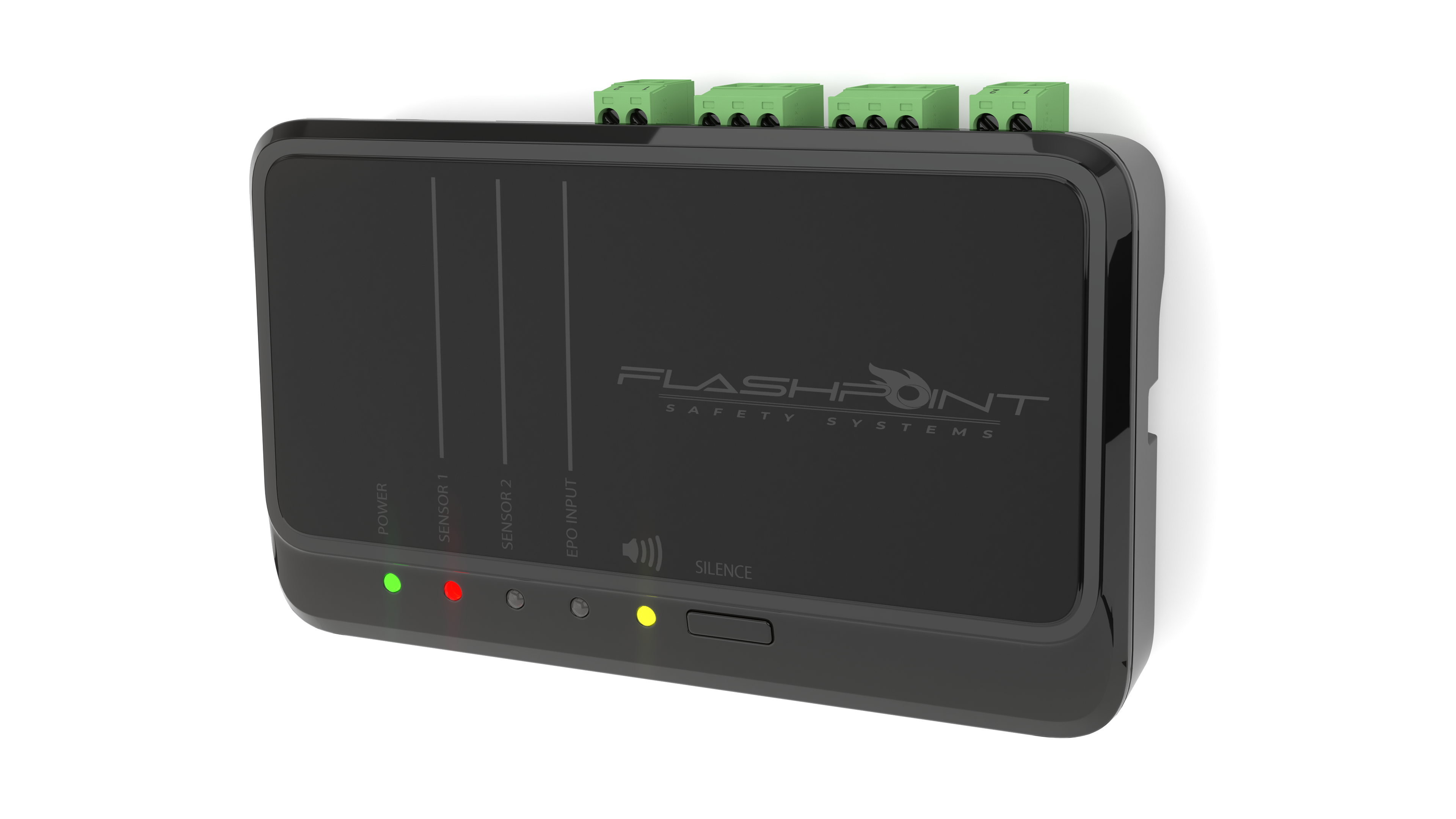
The final product successfully realized the client’s vision, creating a standalone electronic device that is modern, visually striking, and functional. Buttons and indicator lights are positioned for intuitive use, with clear, easy-to-read labels. Connection terminals sit at the top to allow neat cable routing, while carefully chosen materials catch light to highlight different forms and separate components. Flat surfaces provide space for branding, and the clean, minimal front gives the product a polished, deliberate appearance. This final design balances aesthetics, usability, and brand presence, resulting in a cohesive and considered electronic enclosure.